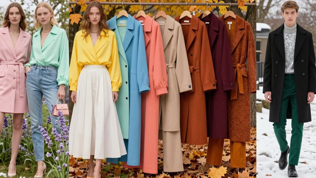

In spring, opt for soft pastels like blush, mint, and lavender, paired with fresh florals and breathable fabrics. Summer calls for tranquil blues and bright, lively combinations such as turquoise or coral, perfect for lightweight materials. Fall features warm tones like amber, saffron, and deep reds, with textured layers and earth tones. Winter favors deep jewel hues like emerald and ruby, along with rich fabrics and metallic accents. Continue exploring to discover how to match these colors with your skin tone for a perfect look.
Key Takeaways
- Spring and summer favor light, bright, pastel hues like blush pink, mint green, and vibrant tropical prints for freshness and energy.
- Fall colors include warm, rich tones such as amber, saffron, deep reds, and earthy browns, with layered textures like knits and suede.
- Winter palettes focus on deep, dark shades like navy, emerald, ruby, and charcoal, complemented by luxurious fabrics and metallic accents.
- Trend insights suggest incorporating nature-inspired, eco-friendly tones, jewel colors, and metallics to stay stylish across seasons.
- Choose colors based on skin undertones: warm tones for warm skin, cool shades for cool skin, and versatile hues for neutral undertones.

ZABERRY Womens Summer Sundresses for Women 2026 Midi Pastel Easter Dress Spring Floral Wedding Guest Knee Length Garden Party Pink Dresses
【Comfy Fabric】The fabric is soft,breathable,stetchy,skin-friendly and lightweight. This sun dresses is the good choice for spring and summer.
As an affiliate, we earn on qualifying purchases.
As an affiliate, we earn on qualifying purchases.
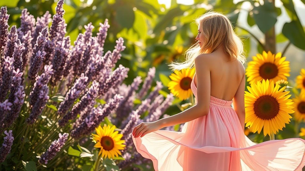
Understanding Spring Color Palette
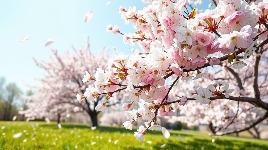
Spring’s color palette is characterized by light, bright hues that evoke freshness and renewal. You’ll find soft pastels like blush pinks, mint greens, and lavender, which create a delicate, airy feel. True Tangerine and Canary yellows inject energy and optimism into your wardrobe, making you stand out effortlessly. Floral and tropical prints pair beautifully with breathable fabrics like cotton and linen, perfect for warmer days. Corn Yellow adds a cheerful touch, brightening any look with its sunny vibe. During spring, lighter-weight clothing that shows skin and moves easily is ideal, helping you stay cool and comfortable. These colors and fabrics come together to reflect the season’s spirit—fresh, lively, and full of promise. Understanding seasonal color palettes can help you choose the most flattering shades and styles for your wardrobe.
Linen Shift Dress for Women, Cotton Linen Sleeveless A Line Mini Dress, Casual Round Neck Loose Summer Beach Swing Sundress Light Blue
Sleeveless Shift Silhouette, Minimalist Vibe: Straight-cut A-line fit moves freely without clinging — regular fit, size up recommended…
As an affiliate, we earn on qualifying purchases.
As an affiliate, we earn on qualifying purchases.
Embracing Summer Hues and Shades
Summer is the perfect time to embrace tranquil blue palettes like Sky, Powder, and Pastel Aqua, which evoke calm and freshness. Pair these shades with breathable fabrics such as linen and lightweight cotton to stay comfortable in the heat. Bright color combinations, like Turquoise with Lagoon Blue, create lively, eye-catching looks perfect for sunny days. Incorporating energy-efficient cloud solutions can also inspire eco-friendly choices in your wardrobe or lifestyle.
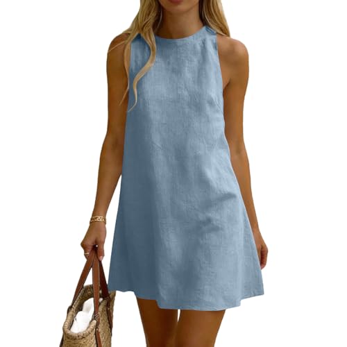
Tranquil Blue Palettes
Tranquil Blue palettes evoke a sense of calm and invigorating, making them a perfect choice for warm-weather wardrobes. These shades, like Sky, Powder, Duck Egg, and Pastel Aqua, evoke clear skies and gentle ocean waves, creating a soothing vibe. They pair beautifully with bright whites, sandy neutrals, and soft pastels, enhancing a relaxed summer look. Incorporate these hues into your wardrobe through lightweight fabrics like linen and cotton, which keep you cool while highlighting the tranquil tones. Whether you choose a flowing dress, a casual blouse, or accessories, Tranquil Blues bring a revitalizing, breezy feel to your summer style. Embrace these shades to evoke serenity and effortless elegance, perfectly aligning with the season’s light, airy aesthetic.
Breathable Summer Fabrics
To stay comfortable and stylish in warm weather, choosing breathable fabrics is essential, especially when highlighting the season’s fresh hues like Sky, Pastel Aqua, and Duck Egg. Lightweight materials like linen, cotton, and chambray allow air to circulate, keeping you cool while showcasing these soothing shades. Opt for loose-fitting designs that promote airflow, and avoid heavy or synthetic fabrics that trap heat and moisture. These breathable fabrics also serve as perfect canvases for summer prints—florals, tropical patterns, or simple solids—enhancing your seasonal look. Incorporating airy fabrics ensures you stay comfortable during hot days without sacrificing style, allowing summer hues to truly shine. Additionally, selecting fabrics with high color accuracy helps maintain the vibrancy of your seasonal colors throughout the day, ensuring your wardrobe remains fresh and lively. Embrace these lightweight textiles for a fresh, breezy wardrobe that keeps pace with the season’s vibrant energy.
Bright Color Pairings
Bright color pairings bring summer hues to life, creating vibrant, eye-catching outfits perfect for warm weather. Combining shades like Sky Blue with Lagoon or Pastel Aqua with Coral instantly energizes your look. Pairing Vivid Turquoise with crisp white or soft linen creates a fresh, breezy vibe. Don’t hesitate to mix complementary colors—think Cerulean with Saffron or Teal with Mustard—to make your ensemble pop. These bold combinations work best with breathable fabrics like cotton, linen, or lightweight knits. Keep accessories minimal to let your colors stand out. Whether you’re heading to the beach or a summer brunch, these lively pairings boost your confidence and capture the essence of summer’s playful, sun-soaked spirit. Incorporating outdoor elements like landscaping or vibrant backyard accents can enhance your overall seasonal style.

Amazon Essentials Women's Long-Sleeve Lightweight Crewneck Sweater, Flattering (Available in Plus Size), Camel Heather, Large
REGULAR FIT: Close but comfortable fit with easy movement.
As an affiliate, we earn on qualifying purchases.
As an affiliate, we earn on qualifying purchases.
Fall Color Trends and Combinations
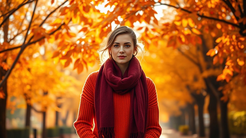
Fall colors bring rich autumnal pairings like warm browns with vibrant oranges and deep reds. You can layer textures such as chunky knits, suede, or wool to add depth and warmth to your outfits. Inspired by the changing foliage, these palettes and textures create cozy, eye-catching looks perfect for the season. Incorporating boho-inspired accessories can elevate your seasonal wardrobe with eclectic charm.
Autumnal Color Pairings
Autumnal color pairings draw from the rich palette of seasonal foliage, combining warm hues like amber, saffron, and mustard with earthy browns and soft cinnamons. You’ll find that these colors naturally complement each other, creating a cozy, harmonious look. Pair a deep chocolate brown with a vibrant saffron or mustard for a striking contrast that still feels grounded. Warm amber and cinnamon shades work beautifully with muted browns or soft ochres, adding depth and warmth. Incorporate textures like suede, leather, or knits to enhance the seasonal appeal. You can also blend rust or terracotta with softer neutrals for a balanced, sophisticated vibe. Practicing color coordination can help you create visually appealing outfits and foster a sense of confidence in your style. These combinations evoke the essence of fall’s changing leaves, making your wardrobe feel seasonally appropriate and effortlessly stylish.
Warm Layering Textures
Layering with warm textures is essential to capturing fall’s cozy, inviting vibe. You’ll want to mix tactile fabrics like wool, suede, and chunky knits to create depth and comfort. Think of combining a soft, camel-colored sweater with a rugged leather jacket or a plaid wool scarf. These textures not only add visual interest but also keep you warm during cooler days. To help you visualize, here’s a quick guide to fall textures and their perfect pairings:
| Texture | Key Colors | Best Use |
|---|---|---|
| Wool | Mustard, Saffron, Deep Brown | Coats, sweaters, scarves |
| Suede | Cognac, Rust, Olive Green | Boots, jackets |
| Chunky Knit | Pumpkin, Burnt Orange, Chocolate | Sweaters, cardigans |
| Leather | Tan, Dark Brown, Burgundy | Jackets, accessories |
Mix and match these textures for warmth and style.
Foliage-Inspired Palettes
Foliage-inspired palettes capture the vibrant transformation of trees changing with the seasons, making them a perfect choice for autumn wardrobes. These colors reflect the warm yellows, fiery oranges, and rich browns seen in nature’s fall display. Think of deep chocolates, soft cinnamons, and amber tones that evoke cozy, layered outfits. Saffron, yellow ochre, and mustard add brightness and energy, while earthy greens and muted rusts create a grounded, sophisticated look. Mixing these hues in textures like wool, suede, and knits enhances the seasonal vibe. These palettes not only mirror nature’s beauty but also offer versatile, warm options for outerwear, boots, and accessories. Incorporate foliage-inspired shades to stay aligned with fall’s natural charm and trend.

fauson Winter Scarf for Women – Long Plaid Tassel Scarf for Women Winter, Warm Large Womens Scarfs Wrap Shawl Ladies Gifts Purple
Super Warm: Featuring a hand-brushing process and dense knitting, scarf for women is anti-pilling, durable, and resistant to…
As an affiliate, we earn on qualifying purchases.
As an affiliate, we earn on qualifying purchases.
Winter Wardrobe Color Selections
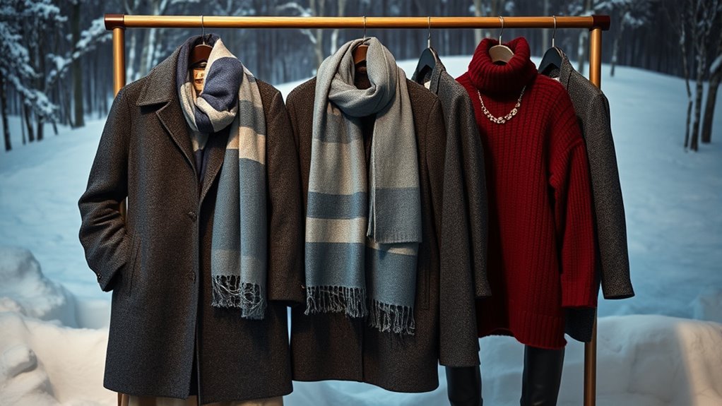
When selecting colors for your winter wardrobe, darker hues and rich textures take center stage to create a warm, sophisticated look. Deep chocolates, charcoal grays, and navy blues serve as versatile neutrals that anchor your outfits. Incorporate jewel tones like emerald green, ruby red, and sapphire for a pop of color that adds elegance without overwhelming. These shades complement heavier fabrics such as wool, velvet, and tweed, enhancing their luxurious feel. Ground your wardrobe with earthy browns and muted olives for a cozy, grounded effect. Metallic accents in gold or silver can add subtle glamour, perfect for holiday events. Overall, stick to a palette that emphasizes depth and richness, making your winter style both timeless and effortlessly chic. Choosing the right colors can elevate your winter wardrobe by creating a cohesive and stylish appearance.
Incorporating Trend Forecasts Into Your Style

Incorporating trend forecasts into your style helps you stay ahead of the curve and guarantees your wardrobe remains fresh and relevant. By paying attention to industry insights, you can select colors that align with upcoming seasonal looks. For example, Pantone’s 85% adoption rate shows how influential these predictions are. Use trend data to choose hues like Golden Path or Tranquil Blues, which dominate spring and summer runways. To make it easier, consider this table:
| Trend Element | Style Tip | Color Example |
|---|---|---|
| Nature-Inspired | Incorporate eco-friendly tones | Saffron, Mustard |
| Tech-Inspired | Add futuristic accents | Neutrals, Metallics |
| Nostalgic | Embrace vintage shades | Chocolate, Cinnamons |
Staying aware of these forecasts ensures your wardrobe stays stylish and aligned with the season’s most current trends. Paying attention to seasonal color forecasts helps you make informed wardrobe choices that keep you looking fresh year-round.
Tips for Choosing the Right Colors for Your Skin Tone
Choosing the right colors for your skin tone can instantly enhance your natural features and elevate your overall look. To do this, identify whether your skin has warm, cool, or neutral undertones. Warm undertones shine with rich, golden hues, while cool undertones glow with blues and pinks. Neutrals can wear a balanced mix of both. Focus on shades that complement your undertones to highlight your best features and boost confidence.
- Embrace warm hues like coral, golden yellow, or warm browns if you have golden undertones.
- Opt for cool shades like sapphire, emerald, or icy pastels if your skin has pink or blue undertones.
- Use neutral tones to create harmony or add contrast.
- Remember, confidence is your best accessory—wear colors that make you feel alive.
- Experiment to find which shades truly make your skin glow.
Frequently Asked Questions
How Can I Mix Seasonal Colors to Create Versatile Outfits?
To mix seasonal colors, start by pairing light, bright hues like pastels from spring with neutral tones for balance. Incorporate summer shades like tranquil blues into your outfits with breathable fabrics for versatility. For fall, combine warm earth tones such as amber and cinnamon with darker neutrals. In winter, layer rich chocolates and browns with deep blues. Mixing textures and layering allows you to create adaptable looks that suit any season.
Which Fabrics Best Showcase Seasonal Colors and Trends?
Imagine sunlight filtering through linen or breathable cotton, perfectly showcasing spring’s fresh pastels and summer’s vibrant blues. Lightweight fabrics like silk and chambray highlight fall’s warm oranges and browns, while thick wool or layered knits emphasize winter’s deep hues. These textures allow colors to pop naturally, making your outfits lively and seasonally true. Choose fabrics that breathe and drape well to truly bring out each season’s mood.
Are There Any Color Combinations to Avoid During Specific Seasons?
You should avoid mixing overly contrasting or clashing colors during each season. For example, pairing bright, pastel spring hues with deep, dark winter shades can create a harsh look. In summer, steer clear of heavy, dark tones that overwhelm light fabrics. During fall, avoid combining too many warm hues without balance, and in winter, skip pairing dark colors with overly bright or neon shades. Stick to seasonal palettes for harmony.
How Do I Adapt Seasonal Colors for Office Versus Casual Wear?
Think of your wardrobe as a garden that blooms differently in each season. To adapt seasonal colors for office wear, choose softer pastels or muted tones, like a gentle sunrise. Pair bright spring hues with neutral pieces for professionalism. For casual wear, embrace bold, vibrant shades or playful prints. Layer with versatile neutrals to create balance. This way, your outfits stay fresh, appropriate, and expressive, no matter the setting.
Can Seasonal Color Trends Influence Everyday Accessories and Footwear?
Yes, seasonal color trends influence your accessories and footwear. You can incorporate spring pastels or summer blues into your bags and shoes for a fresh look. In fall, opt for rich browns and warm tones in your accessories and boots. During winter, darker hues like chocolate and deep blues add sophistication. By aligning your accessories and footwear with seasonal colors, you create cohesive, on-trend outfits that reflect the time of year effortlessly.
Conclusion
Your wardrobe is a reflection of the seasons, vibrant and ever-changing. While spring’s fresh pastels inspire renewal, winter’s deep hues evoke introspection. Embrace these contrasts—light and dark, bold and subtle—to find harmony in your style. Seasons may shift, but your unique palette remains constant. By blending trend forecasts with your personal tone, you craft a wardrobe that’s both timely and timeless, revealing your true colors amid nature’s endless cycle.