To match colors like a stylist, start with the 3ColorPrinciple by choosing one dominant, one secondary, and one accent color to create harmony. Use the 60-30-10Rule to balance these colors proportionally. Explore color wheel schemes like complementary or analogous for variety, and build outfits on neutral bases for versatility. Mastering specific combinations, contrast, and color psychology helps you craft cohesive, impactful looks. Keep exploring these tips to elevate your style even further.
Key Takeaways
- Limit your wardrobe to three main colors using the 3ColorPrinciple to create balanced, harmonious outfits.
- Apply the 60-30-10 rule to proportion colors—60% dominant, 30% secondary, 10% accent—for visual balance.
- Use color schemes from the color wheel—complementary, analogous, triadic—for cohesive and vibrant color combinations.
- Incorporate neutral tones as versatile bases to simplify outfit coordination and highlight accent colors.
- Consider color psychology and symbolism to choose hues that convey the desired mood and enhance your personal style.
Top picks for "color coordination match"
Open Amazon search results for this keyword.
As an affiliate, we earn on qualifying purchases.
Understanding the 3ColorPrinciple for Harmonious Outfits
Understanding the 3ColorPrinciple is essential for creating harmonious outfits that look balanced and stylish. You limit your wardrobe to three colors: a dominant, secondary, and accent. The dominant color forms the outfit’s foundation, setting the overall tone. The secondary color complements the dominant, enhancing harmony and preventing clashes. The accent color is used sparingly—mainly through accessories—to add vibrancy and interest without overwhelming the look. This approach keeps your outfits visually appealing and prevents chaos. By sticking to just three colors, you simplify coordination and guarantee your outfit looks intentional. It creates a cohesive, polished appearance that’s easy to assemble and style. Mastering this principle gives you a strong foundation for developing more complex, well-balanced color combinations later. Free Floating
Applying the 60-30-10Rule for Balanced Color Proportions

The 60-30-10 rule provides a simple yet effective framework to balance colors in your outfit. It guides you to use 60% of a dominant color to set the overall tone. It creates a solid foundation and keeps your look cohesive. Next, add 30% of a secondary color that complements or supports the dominant hue, ensuring harmony. Color harmony is essential for creating pleasing combinations and avoiding visual discord. The remaining 10% should be an accent color—think accessories or bold pieces—that adds vibrancy and interest. Additionally, understanding color accuracy can help you choose colors that truly match your desired style and appearance. Moreover, mastering color proportions ensures your outfit doesn’t appear chaotic or overwhelming. This proportioning prevents your outfit from appearing chaotic or overwhelming. By sticking to these ratios, you create visual balance and a polished appearance effortlessly. It’s an easy method to ensure your outfit remains stylish, balanced, and eye-catching without overdoing any one color.
Exploring ColorWheelSchemes to Create Cohesive Looks

Using the 60-30-10 rule helps you establish a balanced foundation for your outfit, but selecting the right color combinations takes it a step further. That’s where color wheel schemes come in. An analogous scheme uses neighboring colors for harmony, perfect for a subtle, cohesive look. Complementary schemes pair opposite colors for bold contrast, ideal when you want to stand out. Triadic schemes involve three evenly spaced colors, creating vibrancy with balance. Split complementary combines a base color with two adjacent colors of its complement, adding richness without overwhelming. Monochromatic schemes focus on different shades of one hue, offering sophistication. By understanding these schemes, you can craft outfits that are visually appealing and well-coordinated, whether you aim for harmony, contrast, or a dynamic mix.
Building Outfits With Neutralfoundations as a Base

Building outfits with neutral foundations provides a versatile and stylish starting point for any wardrobe. Neutrals like gray, khaki, and white easily pair with a variety of colors, making it simple to create cohesive looks. Use neutral pieces as your base—think tailored trousers, classic blouses, or sleek jackets—and build from there. These foundations allow you to incorporate bolder colors through accessories or accents without overwhelming your outfit. For example, a gray suit can be transformed with a vibrant scarf or colorful shoes, adding personality while maintaining balance. Neutrals also help streamline your wardrobe, making it easier to mix and match pieces. By starting with a neutral foundation, you set yourself up for effortlessly stylish and adaptable outfits.
Mastering SpecificColor Combinations for Visual Impact
You can create striking outfits by mastering classic color pairings like red and green or blue and yellow, which instantly catch the eye. Bold contrasts, such as black and white or vibrant hues against muted tones, add visual punch and energy. By understanding how to combine these specific colors effectively, you’ll elevate your style and make a memorable impression. Additionally, exploring color coordination techniques can help you develop a more sophisticated and harmonious wardrobe.
Classic Color Pairings
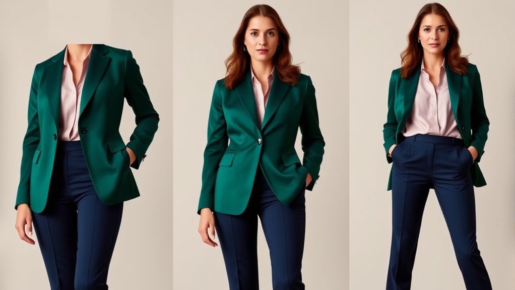
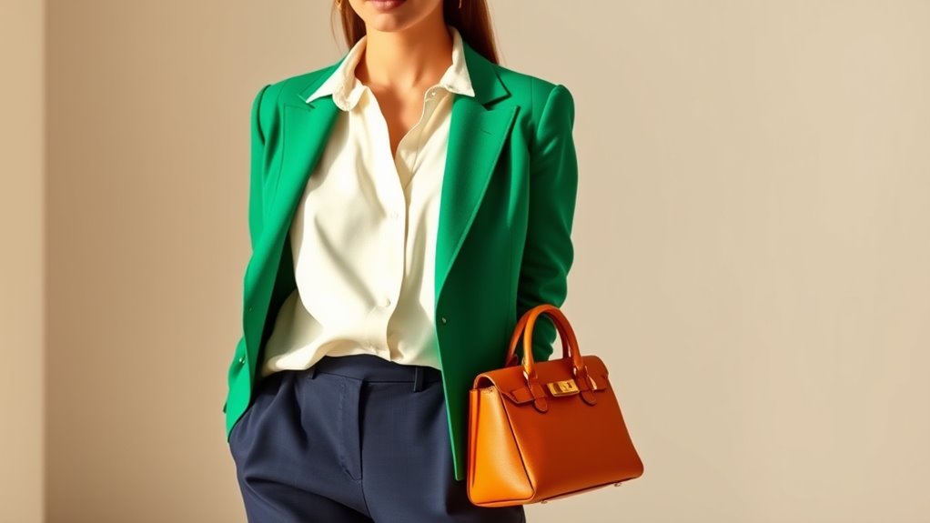
Mastering classic color pairings can elevate your outfits by creating striking and harmonious looks. You’ll want to focus on timeless combinations like navy and white, which exude sophistication and versatility. Red and green make a bold statement, perfect for festive or standout occasions, while black and white offer sleek simplicity suitable for any setting. Beige and khaki create a warm, understated vibe, ideal for casual or professional wear. These pairs work because they’re rooted in color principles—complementary or neutral tones—that naturally appeal to the eye. Using these classic pairings as a foundation helps you build balanced outfits effortlessly. Plus, they’re easy to mix and match with accessories or patterns, ensuring your style remains cohesive and polished every time. Understanding color harmony can further enhance your ability to combine shades effectively, especially by exploring color schemes that complement your personal style and complexion. Developing an awareness of visual balance can also help you create more aesthetically pleasing outfits that draw attention in a positive way.
Bold Color Contrasts
Bold color contrasts create striking outfits that immediately catch the eye and make a strong style statement. To master this, focus on complementary colors from the wheel, like red and green or blue and orange. These pairings deliver high visual impact without feeling chaotic when balanced correctly. Use the 60-30-10 rule to control proportions: let the dominant color set the foundation, support it with a secondary hue, and add a pop with a bold accent. Mixing muted tones with vivid contrasts enhances sophistication. Patterns can help blend contrasting colors seamlessly, while accessories like shoes and jewelry anchor your look. Remember, bold contrasts are about balancing vibrancy and harmony, so experiment confidently but keep proportions in check for a compelling, attention-grabbing outfit.
Using Styling Techniques to Enhance Your Color Coordination

Using styling techniques can substantially elevate your color coordination by creating visual interest and harmony. One effective method is contrasting intensity—pair bold, vibrant colors with muted tones to make each element stand out without clashing. Incorporate the 60-30-10 rule to balance your outfit: use 60% of a dominant color, support it with a secondary hue in 30%, and add a pop of color through accessories in 10%. Experiment with color schemes from the color wheel, like analogous or complementary, to achieve harmony or striking contrast. Neutral foundations, such as gray or white, serve as versatile bases, allowing colorful pieces to shine. Additionally, understanding color psychology can help you select hues that reflect your personality and mood. Learning about color harmony can further refine your choices and create more cohesive outfits. Recognizing color combinations and how they interact can also enhance your styling skills, making your outfits more visually appealing. Exploring color contrast can provide additional options for creating dynamic and eye-catching ensembles. Finally, shoes often anchor your look; choose them carefully to reinforce your overall color palette and style coherence.
Creating Versatile Wardrobes With Capsule Color Strategies

Creating a versatile wardrobe starts with selecting a cohesive color palette that can be mixed and matched easily. Focus on a few core colors—preferably neutrals like gray, beige, or navy—that serve as your foundation. Add a couple of accent hues, such as a bold red or soft pastel, to inject variety. Stick to the 60-30-10 rule: 60% dominant, 30% secondary, and 10% accent colors, ensuring balance and harmony. Use the color wheel to choose schemes like analogous or complementary colors that work well together. Building around neutrals allows you to create numerous outfit combinations without clashing. This capsule approach minimizes decision fatigue, simplifies shopping, and maximizes outfit versatility, making it easy to look polished every day.
Interpreting Color Psychology to Influence Outfit Choices

Understanding color psychology can substantially influence how you choose your outfits, as different colors evoke specific emotions and perceptions. For example, wearing red can convey confidence, passion, or urgency, making it perfect for bold statements or important events. Blues and greens tend to promote calmness, trust, and stability, ideal for professional settings or relaxed days. Yellow radiates energy and optimism, great for casual outings or when you want to uplift your mood. Black communicates sophistication and authority, while white suggests purity and simplicity. By understanding these emotional cues, you can craft outfits that align with your desired message or mood. Incorporating color coordination intentionally can influence perceptions and connect with others more effectively, turning your wardrobe into a powerful tool for self-expression. Additionally, understanding color symbolism can help you select shades that enhance your personal style and boost your confidence.
Frequently Asked Questions
How Can I Incorporate Bold Colors Without Clashing?
To incorporate bold colors without clashing, start with a neutral base like gray or white to tone down the look. Use the 60-30-10 rule to balance your outfit, making bold colors your accent (10%) for vibrancy. Pair them with complementary or analogous shades on the color wheel for harmony. Keep patterns minimal and contrast muted for a cohesive, striking outfit that draws attention without overwhelming.
What Are the Best Color Combinations for Professional Attire?
Think of your outfit as a well-orchestrated symphony, where colors harmonize perfectly. For professional attire, opt for classic combinations like navy with white or gray with soft blue—these create a polished look. Adding a subtle accent, like a burgundy tie or a silk scarf, introduces vibrancy without overwhelming. Stick to neutrals for the base, and use small pops of color to showcase confidence and style, ensuring a sharp, cohesive appearance.
How Do I Choose Accessories That Complement My Outfit Colors?
To choose accessories that complement your outfit colors, start by identifying your outfit’s dominant, secondary, and accent hues. Opt for accessories in neutral shades like black, white, or metallics to add elegance without clashing. If you want a pop of color, select accessories in your outfit’s accent color or a complementary shade from the color wheel. Keep proportions balanced, ensuring accessories enhance without overwhelming your overall look.
Can I Mix Patterns With Triadic Color Schemes?
Think of your outfit as a symphony, and patterns are the instruments. Mixing patterns with a triadic color scheme works if you keep the rhythm steady—use one bold pattern, then add subtle patterns in the other two colors. Balance is key; don’t overwhelm. Limit the scale of patterns, and let the triadic colors unify the look. When done right, your ensemble strikes a harmonious, stylish chord.
How Do I Transition Colors From Day to Evening Looks?
To shift colors from day to evening, start by swapping bright, casual accessories for sophisticated ones. Keep your main outfit colors intact but add darker or richer shades for a more refined look. Incorporate metallics or bold jewelry to elevate your ensemble, and consider layering with a chic blazer or jacket. This way, you effortlessly shift from a relaxed daytime vibe to a glamorous evening style.
Conclusion
Mastering color coordination isn’t just about matching shades; it’s about expressing your unique style with confidence. As you blend hues thoughtfully, you discover that harmony and contrast coexist—like balance and boldness, calm and excitement. Embrace the art of color pairing, knowing it’s both a skill and an expression. In the end, your outfit’s colors speak volumes—sometimes softly, sometimes boldly—but always true to who you are.