
To master print clash with class, start by balancing scale and proportion—pair small prints with larger ones to keep your look cohesive. Use color harmony and neutral patterns to anchor bold designs, and incorporate textures for added interest. Ground busy prints with simple accessories and solid layers, then experiment with unexpected combinations or contrasting fabrics for a striking effect. Keep practicing, and you’ll release even more stylish ways to mix patterns effortlessly.
Key Takeaways
- Balance pattern scale by pairing small prints with larger ones to create visual harmony.
- Use neutral or subdued patterns to ground bold prints and avoid visual overload.
- Mix textures and fabrics, like silk with tweed, to add depth and tactile interest.
- Incorporate neutral accessories and layers to anchor busy prints and maintain a polished look.
- Match colors within prints or use the color wheel to build cohesive, stylish pattern combinations.
Understanding the Foundations of Pattern Mixing

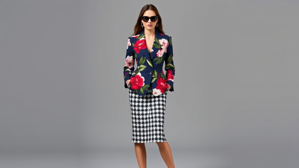
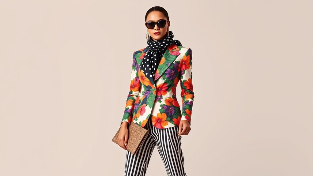
To master pattern mixing, you first need to understand the importance of proportion and scale. You should pair small prints with larger ones to create visual balance, preventing your outfit from looking chaotic. Combining busy patterns with simpler ones helps avoid overwhelming the eye. For example, a small plaid works well with a large floral, maintaining harmony. Varying pattern sizes ensures your look stays interesting without appearing cluttered. Think of bold prints on top and subtle prints on the bottom to keep focus balanced. Remember, mixing different scales and sizes isn’t just about variety; it’s about creating a cohesive visual story. Paying attention to texture and fabric choice can further enhance the overall harmony of your pattern mix. Additionally, understanding visual weight helps you make more deliberate pairing decisions that flatter your overall look. Being aware of pattern placement can also contribute to a more balanced and intentional outfit. Moreover, considering color harmony can tie different patterns together seamlessly, elevating your overall style. Familiarizing yourself with composition and layout principles can help you craft more balanced and visually appealing ensembles. When you understand proportion and scale, you can confidently craft outfits that are both eye-catching and well-balanced.
Mastering Balance: Proportions and Scale Coordination
To create a balanced look, you need to mix different pattern sizes thoughtfully. Pair bold, large prints with subtle, smaller ones to keep proportions in check. Varying pattern scales prevents your outfit from feeling chaotic and guarantees a polished, cohesive appearance. Incorporating energy-efficient strategies can also enhance your overall style by emphasizing sustainable fashion choices.
Vary Pattern Sizes
Varying pattern sizes is essential for creating visually appealing and balanced outfits. Mixing small and large prints prevents your look from appearing chaotic or overwhelming. For example, pair a tiny polka dot blouse with a bold floral skirt to achieve harmony. Combining busy patterns with simpler, more subdued prints guarantees your outfit remains cohesive. Use different scales, like small plaid with large stripes, to add depth and interest. Balancing a bold top print with a subtle, small-patterned bottom keeps proportions in check. Additionally, understanding mammography guidelines ensures you make informed choices about screening and health. Incorporating pattern proportion techniques helps you select the right size combinations for a harmonious look. By varying pattern sizes, you guide the eye naturally across your ensemble, creating a well-curated look. This technique helps you maintain visual order while making bold, stylish statements.
Pair Bold and Subtle
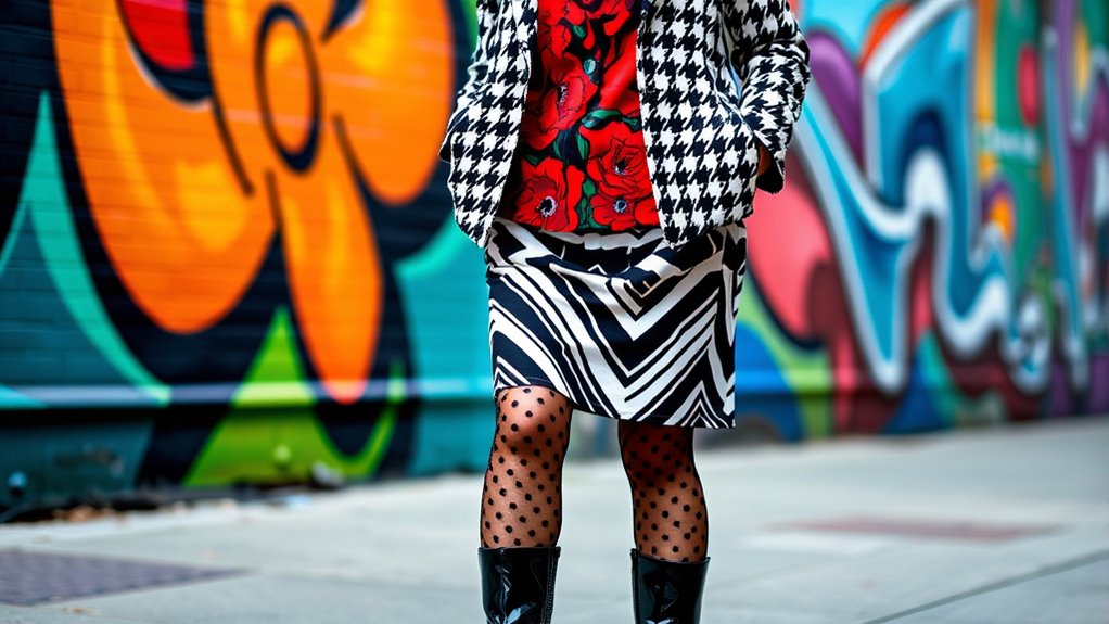
Balancing bold and subtle prints is a powerful way to create visual interest without overwhelming your outfit. You want to pair a striking, statement-making pattern with a more subdued or neutral print to keep your look harmonious. You can also consider the ingredients to watch in your clothing or accessories, as they can influence the overall aesthetic and harmony of your ensemble. For example, match a bold floral top with a delicate striped skirt, or combine a vibrant animal print scarf with a simple monochrome dress. This contrast allows the bold element to stand out while the subtle piece grounds the outfit. Keep proportions in mind: a large, eye-catching print pairs well with a smaller, simpler one. This balance prevents chaos and ensures your outfit feels intentional and polished. Remember, the goal is to highlight your favorite pattern without overpowering your overall look. Additionally, understanding offensive security measures can help you protect your personal style from digital threats, just as balancing prints safeguards your fashion statement. Recognizing visual harmony and color coordination in your outfit can elevate your overall style and make your ensembles look more sophisticated. Incorporating cultural influences can also add unique elements to your pattern mixing, making your look even more distinctive.
Utilizing Color Harmony for Cohesive Looks

Harnessing color harmony is essential for creating cohesive and visually appealing print mixes. You want your patterns to complement each other, so start by choosing prints within the same tonal range or color family. Overlap shared colors between patterns to build connection and unity. Sticking to monochrome or single-color palettes, like black and white, simplifies coordination and adds sophistication. Using the color wheel helps you select complementary hues that enhance each other without clashing. Consider unifying your look with a shared base color that ties all prints together. Incorporating color theory principles can further refine your choices, ensuring your outfit feels balanced and intentional. Seasonal tones can also influence your choices, ensuring your outfit feels balanced and intentional. By focusing on harmonious color schemes, you create looks that are polished, dynamic, and effortlessly stylish.
Incorporating Neutral and Versatile Prints

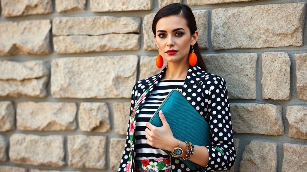
Incorporating neutral and versatile prints into your wardrobe makes mixing patterns easier and more stylish. Neutral prints like stripes, animal prints, and subtle plaids act as reliable bases that seamlessly pair with bolder patterns. Stripes, in particular, serve as a flexible neutral, complementing florals, polka dots, or leopard prints effortlessly. Animal prints such as leopard or snakeskin add texture without overwhelming your outfit, making them perfect starting points for pattern mixing. These prints work well across different styles and seasons, providing a timeless foundation. By choosing versatile prints, you create a cohesive look that’s easy to build on and adapt. This approach helps prevent pattern overload, keeping your outfits polished, balanced, and fashion-forward. Pattern mixing techniques can further enhance your ability to combine prints with confidence. Prioritizing attention to detail ensures each element complements the others, which is crucial in achieving a harmonious and stylish ensemble. Additionally, understanding visual and auditory cues can help you develop a more refined sense of style and coordination. Incorporating insulated jackets for winter can also add to your wardrobe’s versatility, especially when layering with patterned pieces.
Playing With Textures and Fabric Contrasts
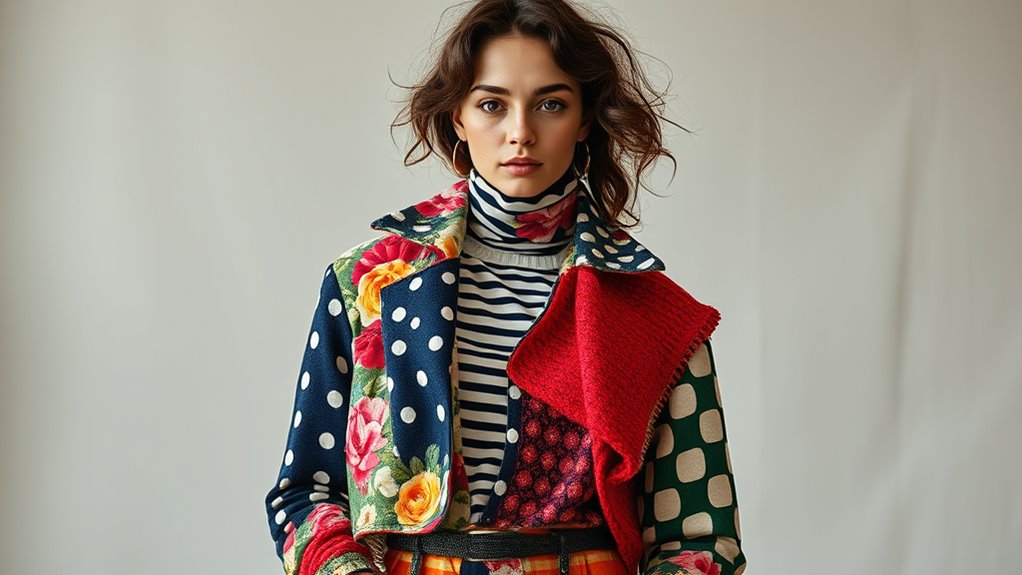
Playing with textures and fabric contrasts adds visual interest and depth to your outfits. Mix smooth silk with rougher fabrics like tweed or denim to create tactile variation. Combining soft knits with crisp leather or structured wool balances comfort with sophistication. Chunky textures, such as cable-knit sweaters, pair well with sleek, tight-fitting pieces, adding dimension without overwhelming. Use contrasting fabric weights—like a lightweight chiffon blouse with a heavy velvet skirt—to highlight differences and keep your look dynamic. Incorporating textures that enhance visual interest by complementing or opposing each other to craft harmony or create intentional tension enhances your overall style. This approach prevents your outfit from looking flat or monotonous, making every outfit stand out with tactile richness and visual intrigue. Additionally, smart home automation can inspire innovative ways to control lighting and environment, paralleling how fabric contrasts can elevate your fashion. Being mindful of textile types helps you create more cohesive and visually compelling ensembles. Recognizing how sensory stimulation influences perception can further refine your styling choices to evoke specific moods or reactions.
Using Accent Pieces and Grounding Elements
To create a cohesive look with mixed prints, start by choosing statement pieces that draw attention without overwhelming the outfit. Incorporate solid accessories and neutral layers to ground bold patterns and add balance. These elements help your overall look stay polished and intentional, even with multiple prints in play.
Select Statement Pieces
Ever wonder how to make bold prints work without overwhelming your outfit? The key is choosing statement pieces that serve as focal points. Opt for a standout printed blazer or a vibrant scarf to anchor your look. These pieces draw attention without competing with other patterns. Keep the rest of your outfit simple, with neutral or solid basics, so the statement piece remains the star. If you’re mixing prints, select one bold item and balance it with subtler, complementary pieces. For example, pair a vivid floral top with understated accessories and neutral bottoms. This approach ensures your outfit feels intentional and balanced, letting your statement piece shine without creating chaos. Remember, a well-chosen statement piece guides the eye and elevates your pattern-mixing game.
Incorporate Solid Accessories
Incorporating solid accessories is a smart way to ground and balance busy print combinations. When you wear loud patterns, adding a simple, solid piece helps anchor the look. A neutral handbag, belt, or shoes can serve as a visual break, preventing the outfit from feeling overwhelming. You can also use accent pieces like a bold-colored scarf or a statement watch to tie the outfit together without competing with prints. Grounding elements like a tailored blazer or solid trousers create a stable base, making the overall look more cohesive. These accents not only enhance your style but also give your outfit a polished finish. Remember, solid accessories act as a visual pause, allowing your prints to shine without chaos.
Balance With Neutral Layers
Adding neutral layers and grounding pieces is an effective way to balance busy prints and prevent your outfit from feeling overwhelming. Incorporate solid-colored items like blazers, cardigans, or trousers to anchor bold patterns. These neutral elements create visual rest, allowing your prints to stand out without competing. Use subtle hues like black, white, beige, or gray as versatile grounding options. When mixing multiple prints, add a neutral piece between them to break up the visual intensity. Accessories such as scarves, handbags, or shoes in neutral shades also help tie the look together without adding chaos. By layering with these calming elements, you ensure your outfit remains polished, balanced, and effortlessly chic. Neutral layers serve as the perfect foundation for showcasing your playful prints.
Exploring Advanced Clash Techniques for Bold Fashion
To truly make a bold fashion statement, you need to push beyond traditional matching and experiment with advanced clash techniques. Start by pairing similar patterns in different styles, like modern polka dots with vintage-inspired ones, to create a fresh contrast. Try mixing unexpected prints, such as camo with polka dots or tribal with houndstooth, to surprise the eye. Use the same print in varying colorways or invert the colors for a striking effect. Draw from your wardrobe’s color palette to create harmony even in bold combinations. Theme-based mixing, like combining different animal prints, adds a playful edge. These techniques challenge conventions and elevate your outfit, making your pattern clashes look intentional, stylish, and undeniably daring.
Tips for Beginners: Starting Small and Building Confidence

If you’re new to mixing patterns and prints, starting small is the best way to build confidence and avoid feeling overwhelmed. Begin with simple pairings, like stripes with polka dots or a floral print with a solid color. Focus on matching colors within your prints to create harmony. Use neutral prints, such as stripes or animal prints, which are easier to combine with bolder patterns. Keep pattern sizes modest; pair small prints with larger ones to maintain proportion. Incorporate basic accessories, like a printed scarf or shoes, to introduce prints gradually. Don’t rush into mixing multiple patterns at once—build your skills step-by-step. As you gain confidence, experiment with more complex combinations. Starting small helps you develop an eye for balance and style effortlessly.
Inspiring Outfit Ideas to Elevate Your Pattern Game
Elevating your pattern game starts with thoughtful outfit ideas that make mixing prints look intentional and stylish. To achieve this, focus on balancing scale, color, and texture. For example, pair a small floral print with a large plaid to create visual harmony. Use the following strategies:
| Pattern Strategy | Example |
|---|---|
| Mix sizes for balance | Small polka dots with bold stripes |
| Match color schemes | Black-and-white animal print with striped top |
| Use neutral prints as base | Stripes or animal prints with solid colors |
| Incorporate contrasting textures | Chunky knit with sleek printed skirt |
These ideas make your look cohesive and fashionable, ensuring your pattern combinations stand out effortlessly.
Frequently Asked Questions
How Can I Avoid Pattern Overwhelm When Mixing Prints?
To avoid pattern overwhelm, start by balancing small and large prints for proportion. Pair busy patterns with simpler ones, like a floral with a solid or stripe. Use neutral prints, such as stripes or animal prints, to tone down loud patterns. Incorporate textures for contrast, and add solid accessories or layers to ground your look. Keep color schemes cohesive, sticking to a monochrome palette or complementary hues to maintain harmony.
What Are the Best Color Combinations for Pattern Pairing?
You should choose color combinations that are harmonious and cohesive. Opt for prints in the same tonal range or within a single color family, overlapping shades for unity. Monochrome palettes like black and white work well, or use the color wheel to find complementary hues. Ground your patterns with a shared base color or seasonally suitable tones, ensuring your prints blend seamlessly without clashing.
Which Prints Work Best as Neutral or Versatile Options?
Did you know that stripes are considered the most versatile print, used in over 60% of outfit pairings? You’ll find that stripes and animal prints like leopard or cheetah work best as neutral options, easy to mix with other patterns. They add visual interest without overwhelming your look. Use stripes as a foundation, and incorporate animal prints for pattern variety, keeping your outfits balanced and stylish effortlessly.
How Do I Balance Different Textures in a Patterned Outfit?
To balance different textures in a patterned outfit, start by pairing structured fabrics with softer ones, like a smooth silk blouse with a chunky knit. Mix large textures, such as corduroy, with smaller patterns to create contrast. Use opposing textures deliberately, like leather and lace, to add depth without overwhelming your look. Keep the color palette cohesive to unify the textures, ensuring your outfit stays balanced and visually interesting.
What Are Simple Ways for Beginners to Start Mixing Prints Confidently?
Think of mixing prints like a dance—start simple and find your rhythm. Begin with stripes and animal prints, as they’re natural allies. Keep colors within the same family or use neutral tones like black and white to tie everything together. Vary print sizes—small with large—to create balance. Add a solid piece, like a blazer, to ground the look. With confidence, you’ll turn pattern mixing into your signature style.
Conclusion
Remember, mastering print clash is like learning to dance—you start with small steps, then find your rhythm. When I first tried mixing patterns, I felt awkward, but with patience, I discovered my unique style. Just like a dance routine, it’s about balance and confidence. So, don’t be afraid to experiment—each bold move brings you closer to fashion harmony. Trust yourself, and soon you’ll be confidently creating looks that turn heads.